Description
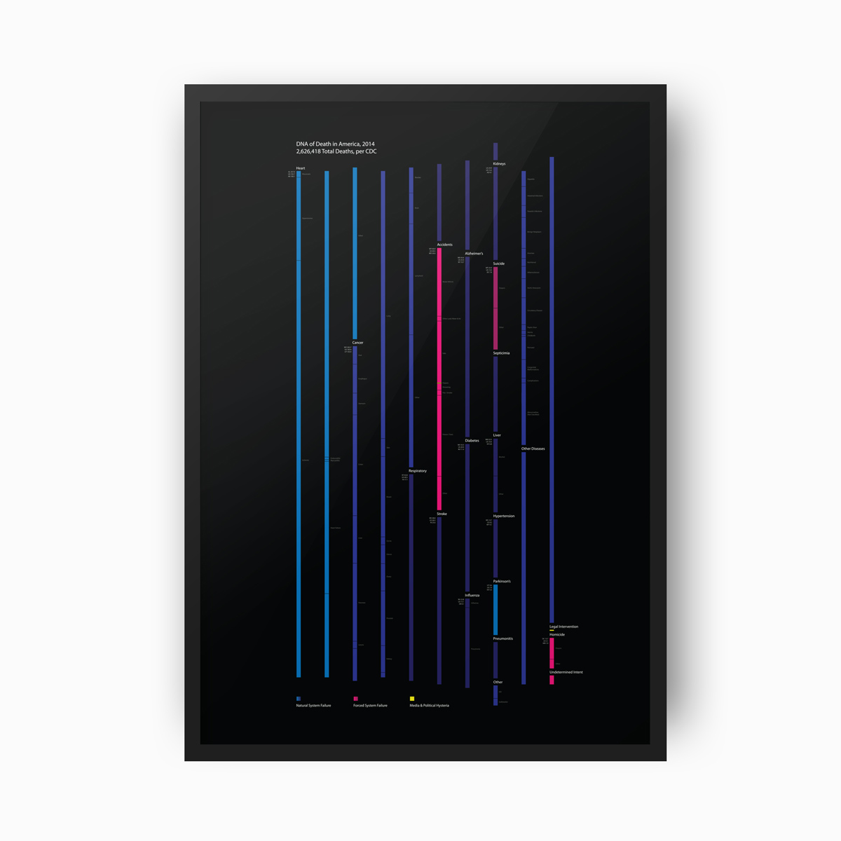
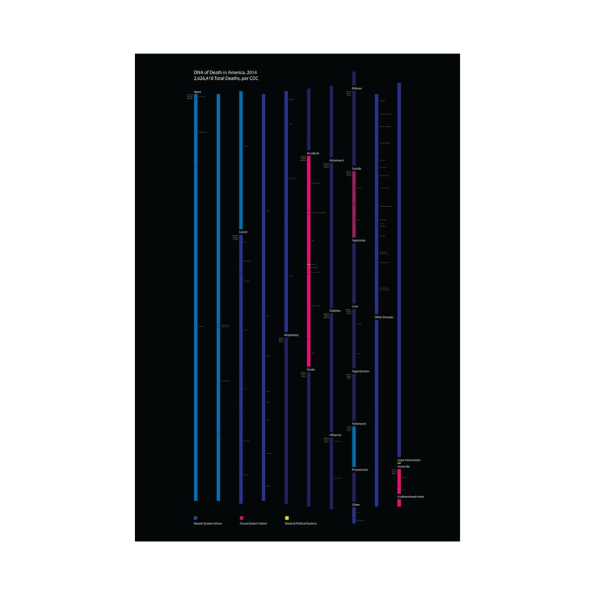
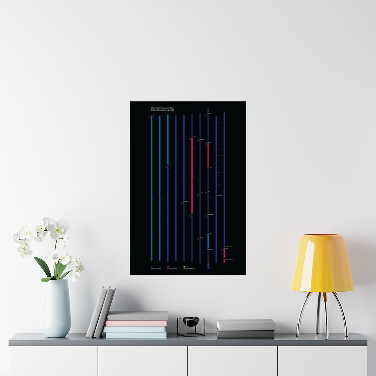
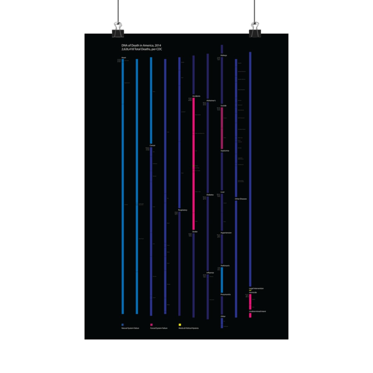
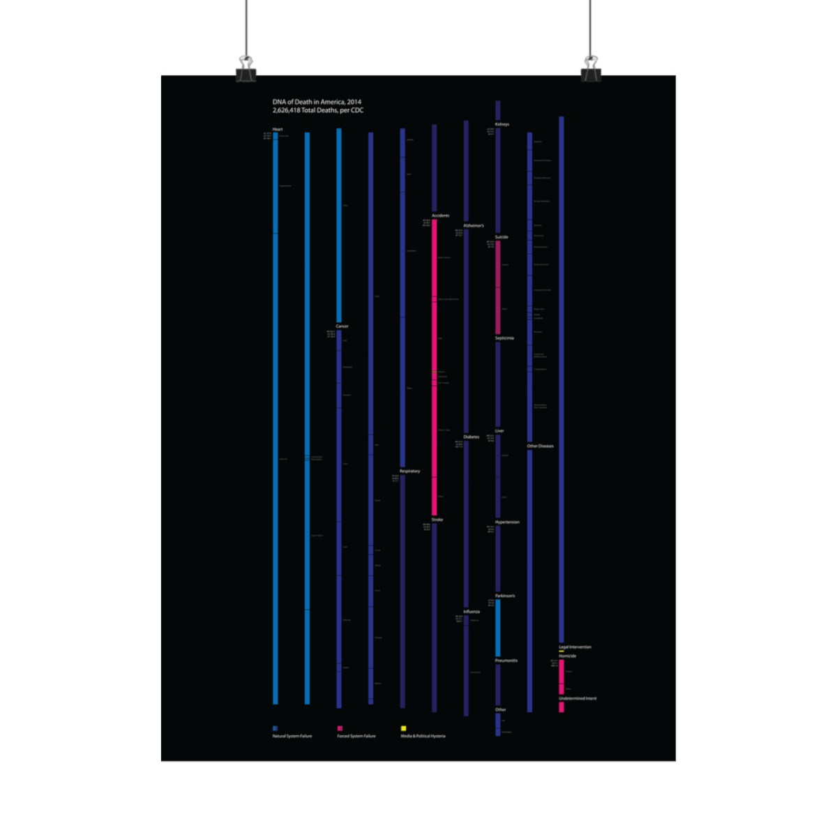
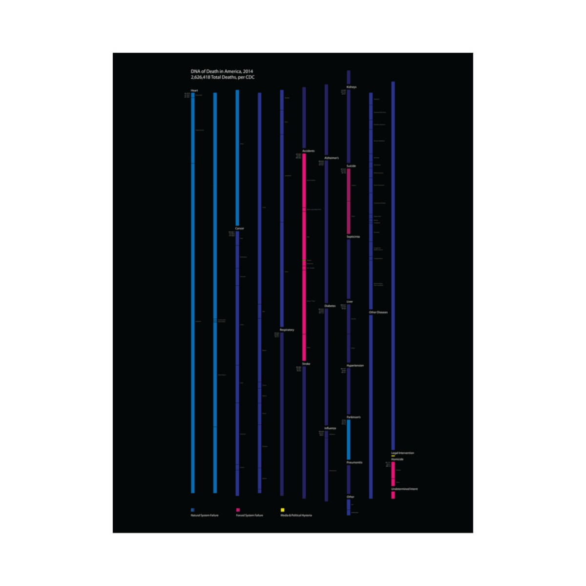
This particular visualization stemmed from my questioning of the media’s reporting, which seems to suggest that we are all one breath away from dying in a mass shooting, at the hands of police violence, or in the razor sharp grasp of a Great White shark.The CDC catalogued 2,626,418 deaths and I decided to break them down into three main categories: 1) Natural System Failure (blue/purple tones) 2) Forced System Failure (pinkish tones) and 3) Media Hysteria (bright yellow).What immediately jumps off the page from this particular visualization of the way Americans die is that the media’s hysteria is completely incommensurate with the actual data. In fact, at first glance, one is hard pressed to even notice the bright yellow bands denoting mass shootings, accidental gun violence and police violence, which, itself, is a minute subcategory of the already small “legal intervention” which the CDC uses to denote such deaths.My two main takeaways from this visualization: 1) aggregate numbers matter 2) there is a reason statistics has a book written about it entitled Lies, Damn Lies, And Statistics: The Manipulation Of Public Opinion In America and one would be wise to proceed with caution when parts are broken off the aggregate, in guileful attempts to strengthen particular agendas.
Frame not included.








Reviews
There are no reviews yet.