Description
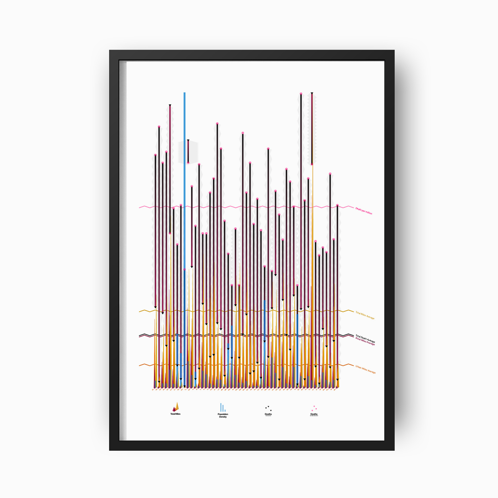
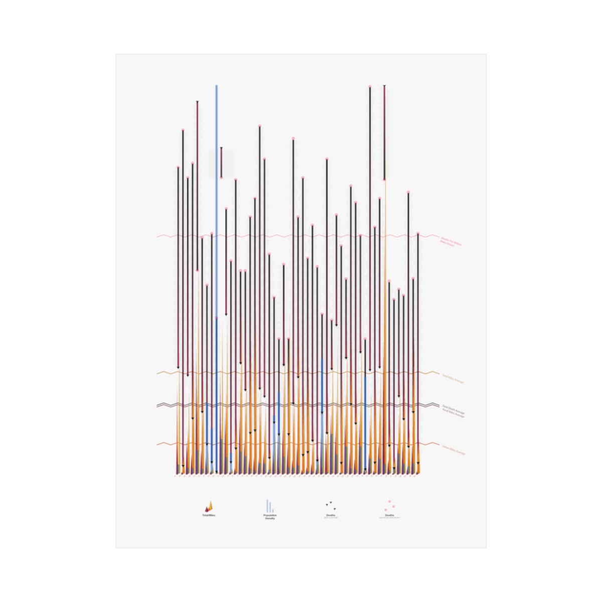
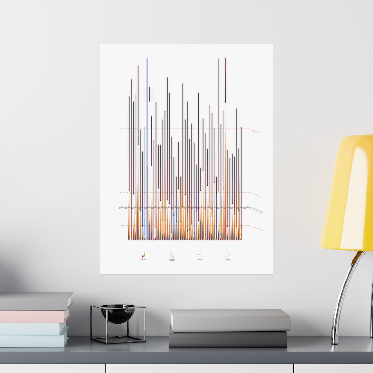
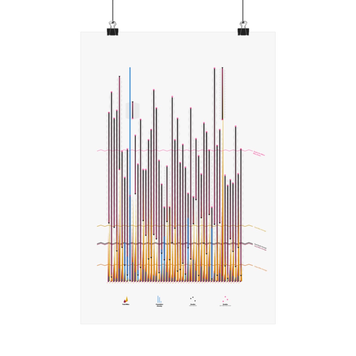
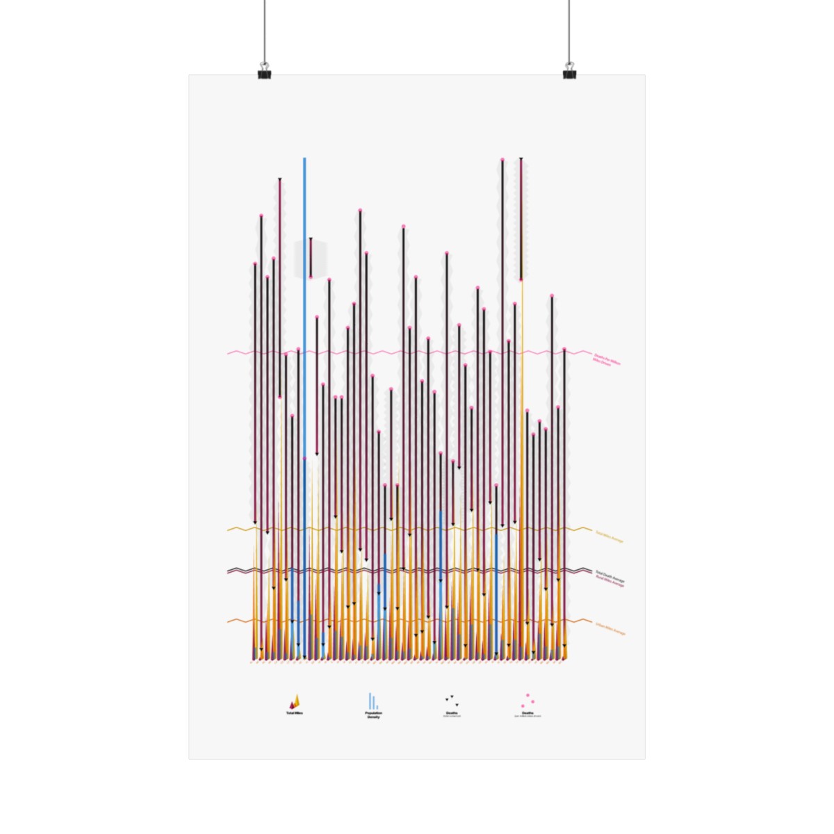
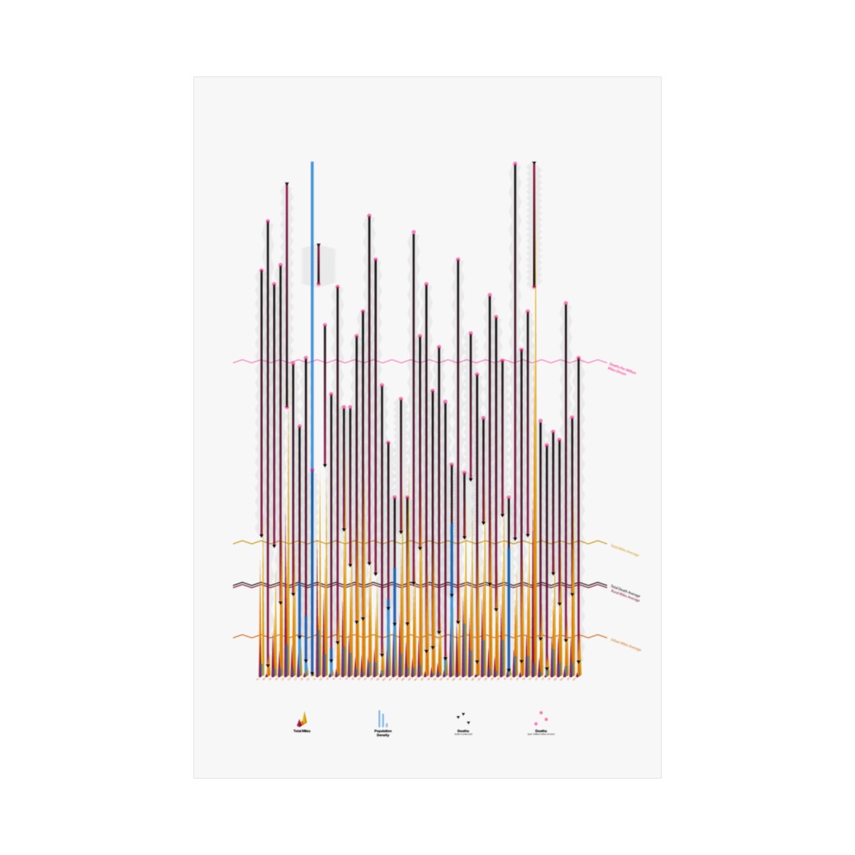
It comes as no surprise that the Department of Transportation keeps detailed records of America’s roadways, but seeing a bunch of numbers in a spreadsheet is hardly interesting. I started this design be simply visualizing each state’s total road miles (8,656,070 from the data set I worked with), then broke them into “rural” miles and “urban” miles. From there, I wanted to see how total deaths and population density correlated with the miles breakdown. Next, I added a layer for “deaths per million miles driven”, which surprisingly reveals South Carolina as having the nation’s most dangerous roads (even though total deaths for California and Texas are significantly higher). Finally, I presented averages for each of the categories and for some needed design intrigue, visually connected the “total deaths” with the “deaths per million miles driven”. Amazingly (coincidentally?) the lines for “average total deaths” and “average rural miles” are almost exactly the same. My hunch is that this means most deaths occur at high rates of speed on highways outside of urban areas, which seems intuitively correct, however, was visually and viscerally arresting when I plotted the lines.
Frame not included.











Reviews
There are no reviews yet.